Developing a new brand
With forthcoming product releases on the horizon we thought our branding needs a spruce up!

Companies generally want to be able to use their logo in all of their devices or surfaces and in any context.
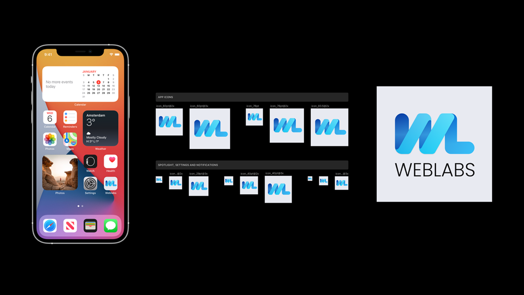
To meet this expectation of the corporate arena, the new logo design has to be adaptable to layouts and sizes on different devices.
This functional range suits the obvious change of our logo to a simpler Initialism : 'WL'. These letters can fit a smaller pologon platter, and can be described with the full 'WEB LABS' when necessary.
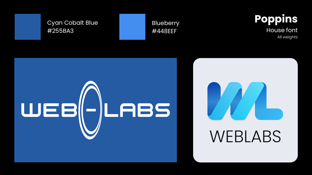
The concept of transformation in the old logo are the oval ripples between the hyphenated words ' web - labs'. We wanted to retain that theme somehow so after a few experiments we reintroduced a helix into the Initialism and superimposed it.
The colours were finally added and for continuity we've used the blue tones Blueberry and Cyan Cobalt Blue.
Our house font will move from Zurich to Poppins.

Last updated: 28 April 2022